Thursday 29 September 2011

Photographs For School Magazine

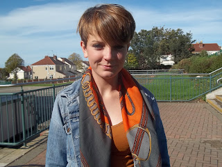
Today in our media lesson we went out and photographed our images for our School magazine here are our images we managed to capture...
Medium Close up which will be used as a additional image.

Over the shoulder shot which will be used as a additional image.

Long shot  which will be my main front cover image.

Medium close up.

Over the shoulder shot.

Long shot

Very long shot

Medium close up

Long shot
Long shot.
Over the shoulder shot
Medium close up which i will use as my main contents image.


Wednesday 28 September 2011

Plans for School Magazine

For this lesson we were asked to plan out our ideas for our school magazine below is what we came up with...

Ttile of the magazine: Schools out
Main image & Headlines : Meduim close up of a person holding exam results
Main colours: Red
Regulars:
- Revison Tips
- Competitions
-Day in the life of ...
- Freebees
Features:
- Ways to excell in education
- Quiz
-Help Letters
-Interveiws
- Revision Tips
- Exam Success
- Organisation

Monday 26 September 2011

Camera Shots

Todays lesson task was to produce our own photographs of different shots in twenty minutes sticking to the instructions and to allow us to be creative, below are the photographs we managed to create.
  • A low angle medium close up,( Looking up , half of body)
  • A high angle log shot,(Looking down, Whole person)
  • An extreme close up of the time,(One number or hand on a clock)
  • A big close up of someone using a mobile phone,(face and phone)
  • A close up of someone in nature,(Persons head and shoulders)
  • A two shot in medium long shot,( two people in photograph , head and shoulder)
  • An over the shoulder shot of someone writing,(shoulder and hand writing on a peice of paper)
  • A very long shot of conveying isolation,( very far image of a picture or person)
  • A medium close up,( above the waist of a person, upper body and shoulders)
  • A longshot,(whole body)
  • A photograph which has connotations of friendship,(situation or object which could indicate friendship)
  • A photograph which has connotations of stress,(situation or object which could indicate stress)


A very long shot of conveying isolation, (very far image of a picture or person)

   A photograph which has connotations of friendship,(situation or object which could indicate friendship)

     A two shot in medium long shot, (two people in photograph, head and shoulder)

A high angle log shot, (Looking down, Whole person)

A low angle medium close up, (Looking up, half of body)

A high angle log shot, (Looking down, Whole person)

                                A close up of someone in nature,(Persons head and shoulders)

A medium close up, (above the waist of a person, upper body and shoulders)
A photograph which has connotations of stress, (situation or object which could indicate stress)
An extreme close up of the time, (One number or hand on a clock)
 A big close up of someone using a mobile phone, (face and phone)


Friday 23 September 2011

Codes and Conventions of a Contents page.

Today in our lesson we discussed as a group the codes and conventions of a music magazines contents page here is what we discovered...
  • Font size 11 point.
  • Contents top of page.
  • Date is at the top of the page.
  • The main image dominates the page.
  • Can be a double page spread.
  • Smaller images.
  • In colums split either into one or two.
  • Large font.
  • Sub headings.
  • Issue numbers.
  • Page numbers - anchor the story to the image.
  • Editors letter.
  • Credits.
  • Bold titles.
  • Website.
  • "Contents "have the biggest font.
  • Titles of the credits are bolder.
  • Mini article on some of the contents page.
  • Font is always clear and consistant.
  • Images are all different sizes.
  • Sticks to the same colour scheme.
  • Article must be about music.
  • Descriptions on soem of the page.
  • Coverlines in font 12 or 13.
  • Plain backgrounds and two main colours.
  • Main image has the page number.
  • In popular articles the page number is bigger.
  • Most of the information is either boxed or in a box shape.
  • Short coverlines.
  • Page numbers for each story.
  • Contact details and Address.
  • All layed out in colums.
  • Headings-"Features, Regulars".
  • Line breaking between each point.


Thursday 22 September 2011

Codes & Conventions of a Music Magazine

In our Media lesson today we worked in groups of four and viewed a couple of different music magazine covers and then disscussed the codes and conventions , here is what we came up with...

Masthead
  • Title
  •  Postitioning statement-sets out the magazines ethos e.g kerrang '' life is loud''.
  •  Title is kept clear and seperate from the image unless the magazine is established.
  • Title has unique font which is large and bold.
Barcode
  • Generally bottom right hand side of the page.
  • Contains the issue date , price and the website.
Buzz Words
    • "Plus exclusive" makes the read want to read on and makes them think there getting extra for there money.
Images
  • One main image
  • Sometimes subsiduary images which are smaller.
  • Close up or mid shot image.
  • No text onthe face of the image.
  • "Direct Address" - Looking straight at the camera.
  • Images usually are relevant to what inside.
Colours
  • Colour scheme is consistant.
  • Usually simple colours that dont clash.
  • 3/4 colours.
  • Colours reinforce the brand.
Coverlines
  • Smaller  than main image coverline.
  • Is in the same style of font.
  • Always relates to stories inside the magazine.
  • Relates to genre of magazine.
  • Limited range of font , Serif , Times new Roman and sans serif.
  • Font smaller for bigger price.
  • Plain background.
Main Image
  • Band - Long shot/ Medium longshot.
  • Person close up.
  • Direct Adress , look at the camera.
  • Body Language of the person in the image must fir genre of magazine.